
A practical guide to painting like L.S. Lowry: sketch crowds from memory, use a limited palette with
.S. Lowry's matchstick figures and smoky millscapes aren't just nostalgic curiosities—they're a masterclass in economy and observation. I spent a rainy weekend copying 'Coming from the Mill' at the Lowry in Salford, and what struck me wasn't the crowd of tiny people but the way he handled the sky. It's almost flat, a pale industrial wash, yet it sets the whole mood. If you want to understand Lowry, start by looking at his edges. The factory roofs, the railings, the hunched shoulders—everything has a slightly wobbly。hand-drawn quality. That's deliberate. He wasn't after photographic accuracy;he was after the rhythm of a working town.
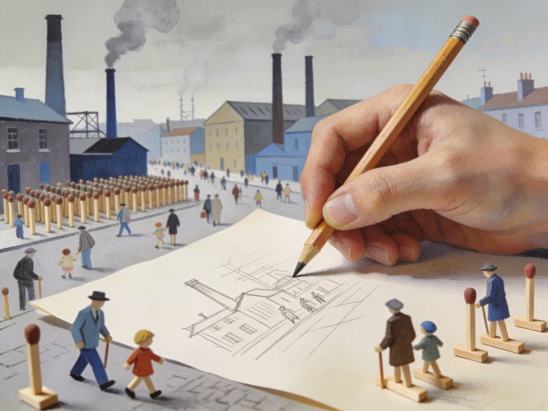
Drawing like Lowry means embracing repetition without making it boring. His distinctive figures, those 'matchstick men' and women, evolved from years of sketching crowds at Salford racecourses and markets. Grab a sketchbook and spend an hour in a busy bus station or a supermarket car park. Draw people as simple verticals and angles—no faces, no details. Lowry often painted from memory, and you should too. Do a few quick studies on site。then go home and paint from those scribbles, not photos. You'll notice your figures become more expressive, more like a Lowry, because you're filtering out the noise and keeping the gesture.Palette matters more than you think. Lowry's industrial scenes are often described as monochrome, but they're not. There's a lot of lead white, ivory black, and yellow ochre, with sudden flashes of vermilion on a coat or a shop sign. I mixed a 'Lowry grey' once—roughly four parts white to one part black with a touch of raw umber—and it changed how I saw his paintings. The key is restraint. Use a limited palette and let one or two bright accents carry the emotion. His skies are rarely blue;they're often a pale, milky grey that feels heavy with soot. Try painting a rooftop scene with just titanium white。ivory black, and a single tube of cadmium red. You'll be surprised how much life you can get from so little.
Composition in Lowry's work is deceptively casual. He often placed a single figure or a small group off-centre。leaving vast empty foregrounds of cobblestones or playing fields. That emptiness isn't lazy—it's a breathing space that makes the crowded background feel even denser. Take 'Britain at Play' (though it's not his typical industrial scene, it's a great lesson in crowd control). He layers groups at different scales, using zigzag paths and diagonal streets to lead your eye. When you sketch your own street scene, resist the urge to fill every corner. Leave a patch of pavement bare. Let the eye rest. Lowry knew that a painting isn't a photograph;it's an edited memory.
Finally。stop trying to make Lowry 'pretty'. His work is often bleak, and that's its power. The people are isolated even when they're packed together. The factories loom. The weather is grey. I once heard a curator say that Lowry painted 'the poetry of the ordinary', and that's the goal. Don't add unnecessary detail or dramatic lighting. Go for the flat, honest look of a northern town on a Tuesday afternoon. Use a slightly rough canvas or board—Lowry often painted on board—and don't overblend. Leave brushmarks visible. The imperfections are what make it feel human.